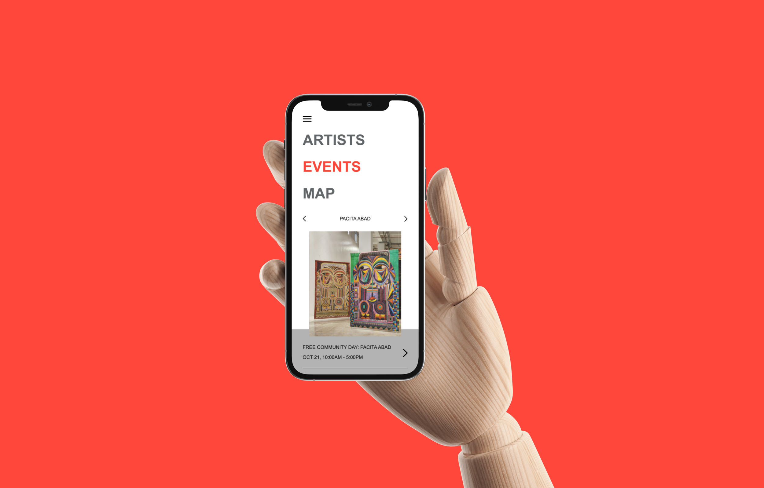
SF Moma Map Application
Application | Branding | Flowcharts | User Interface | Prototyping
Project Overview
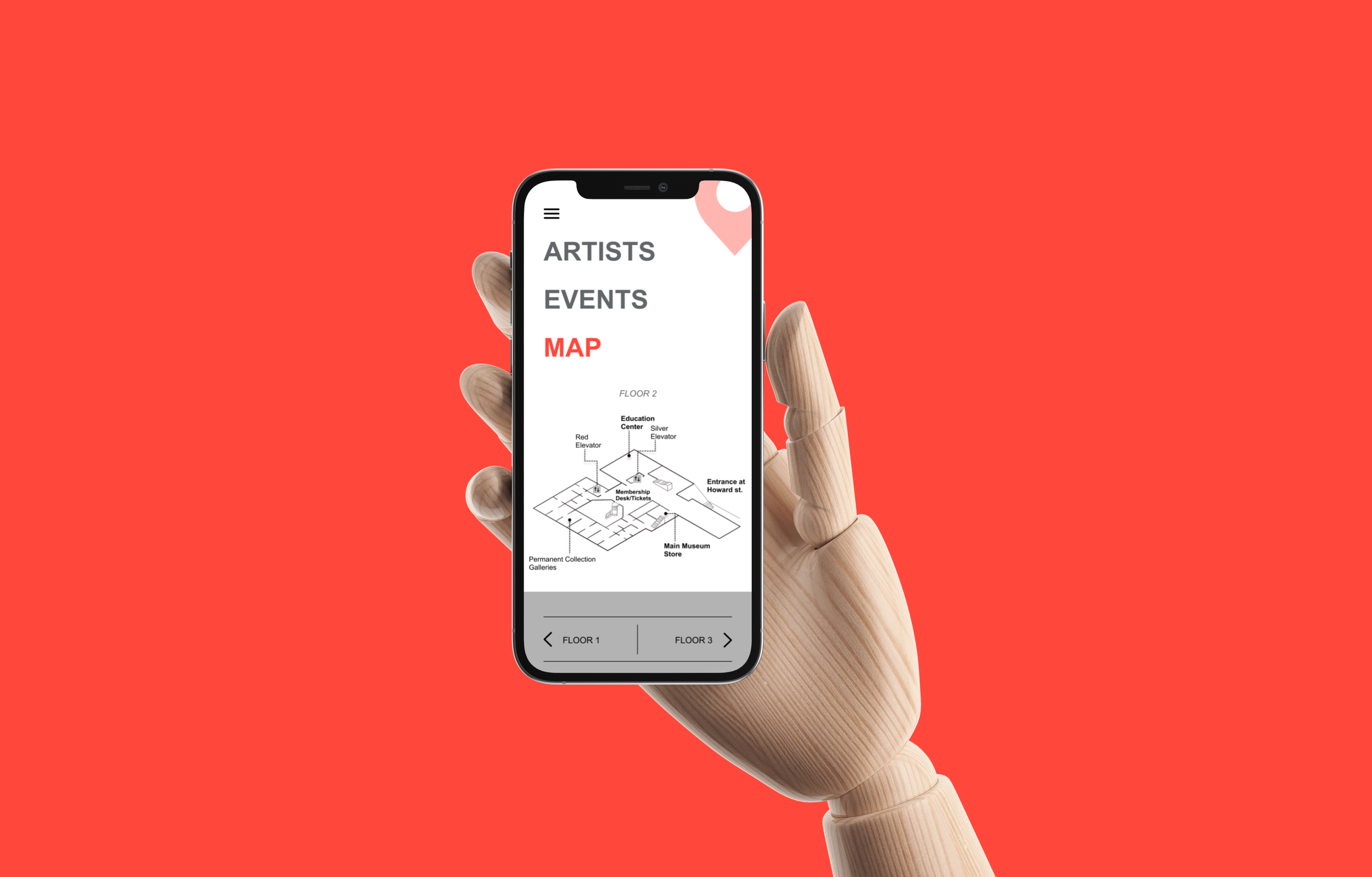
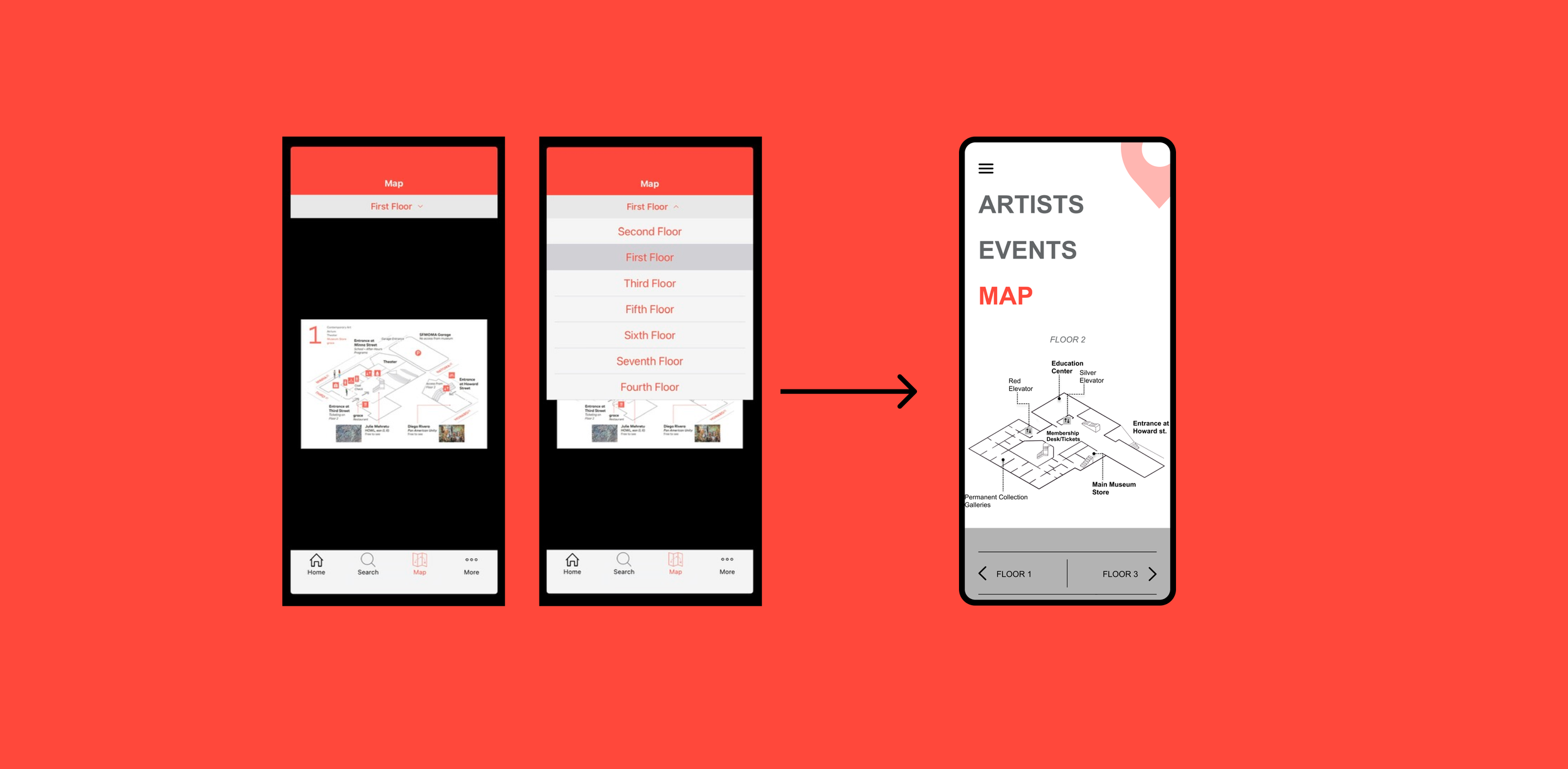
The SF MOMA redesign project started because of an unclear map experience on the existing application. With the previous app being a touch point of the museum users need to find their way around the museum. Using the redesign, museum attendees will be able to see busy locations and navigate their experience at the museum with ease.
Starting with the basics. Who, what and why.
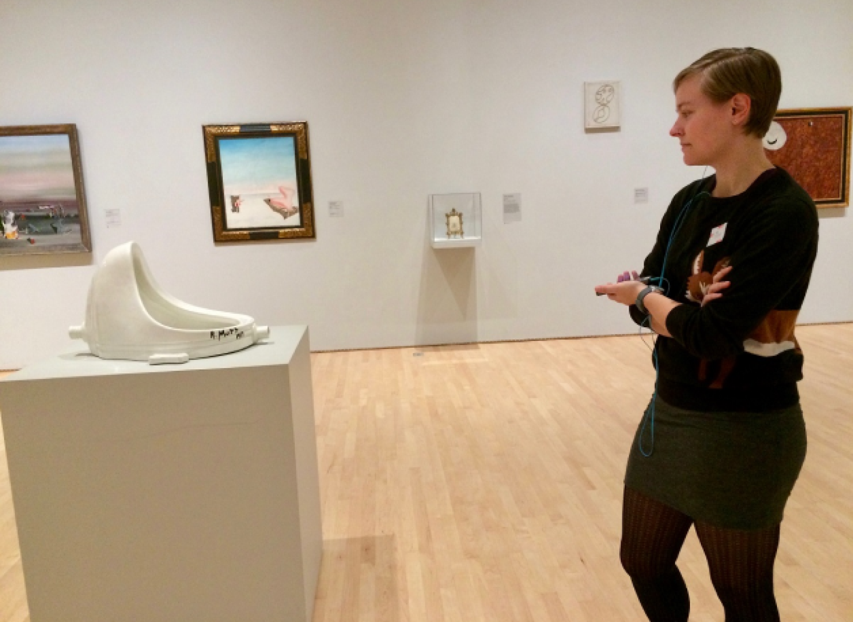
In 2017 the SF MOMA transformed the museum experience by strategically defining its, audience, user persona, and location-aware audio experience. The research and development ended up creating a digital platform with 20 hours of new audio, visitors could embark on 15-45 minute guided tours or enjoy a short audio insight based on the art. Curated lists of nearby audio stories ensured visitors never miss must-see art. SFMOMA also prioritized trust and engagement, connecting visitors with digital and in-person cultural ambassadors. With its syncing function users could listen to tours with their party.
The Probelm
An unclear map experience that is difficult to use
Proposed solution
Users can explore the museum with a digital guide while also accessing a map that shows crowd levels based on other users' locations. The map provides an overview of all levels and exhibit details. This solution will engage the main three senses to ensure that they will be able to enjoy the art as best as possible:
Hearing: Users can listen to audio descriptions and narratives about the art and exhibits, adding depth to the experience. Touch: The app's interactive features allow users to engage with the map and access information through touch-based interactions. Sight: The map visually presents the museum's layout and exhibit descriptions.
Just like the study done in 2017, I aim to ensure that there is still a heads-up phone pocket mindset, but now allowing a user to not be crowded
Defining the flow
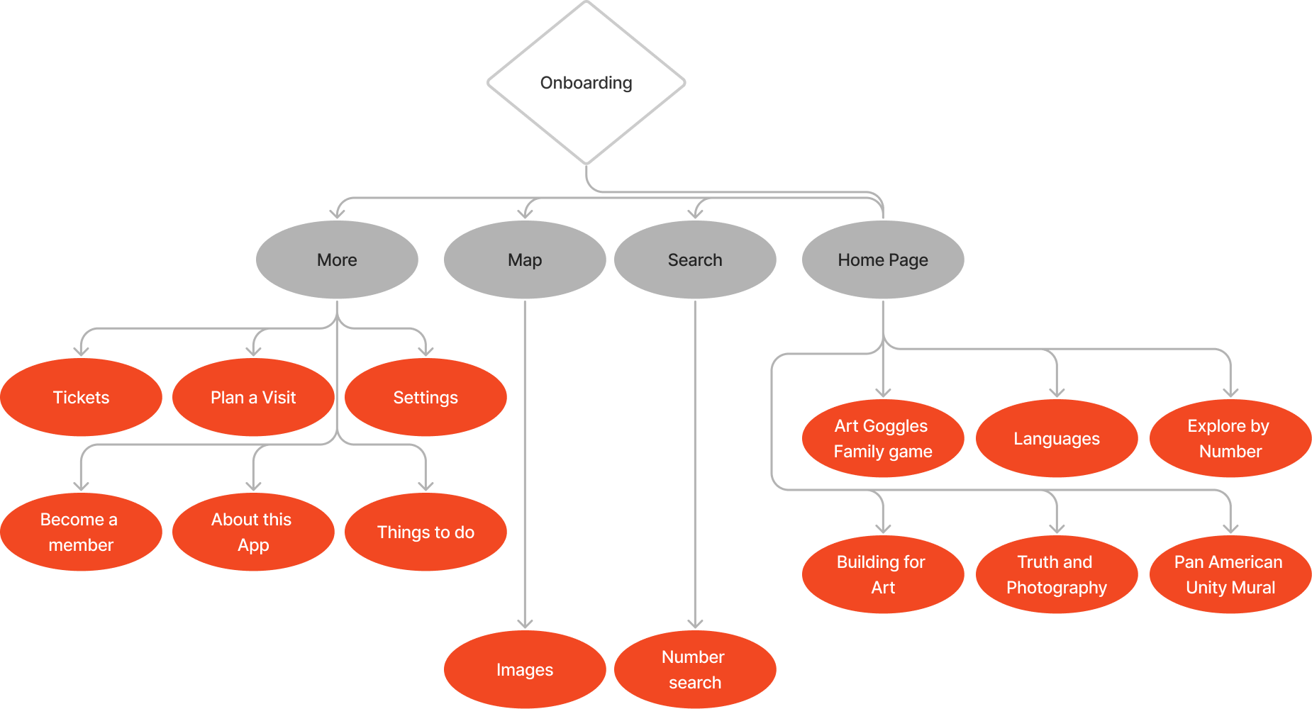
The old SFMOMA application's site map often led to confusing navigation and hindered users from easily finding their way. The previous version presented numerous options and appeared to immerse users in their phones rather than aiding their search for specific artworks. In contrast, the new map feature takes center stage, prioritizing straightforward navigation. While it still maintains the search for artwork function and audio listening tours, these features are integrated within the map interface.
Scrapped “Final”
Final UI
The final design wasn't developed solely based on feedback from my original "final" design. I took further steps by completely remodeling the user experience (UX) of the app. Afterward, I proceeded to design the final landing page and mobile user interface.
